NEWS ALERT - We won a SILVER IPM award for Best use of Social Media, 2025! Read more🏆

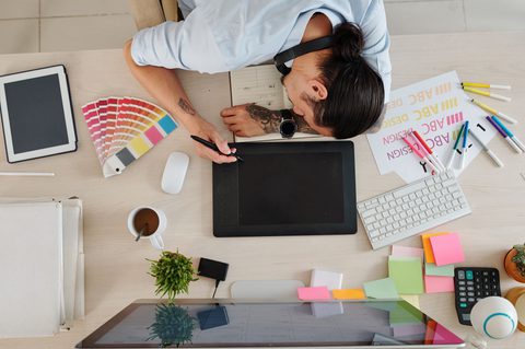
As a Creative Director specialising in all things digital and UX, Gemma had her hands full when it came to designing our new website. Working closely with Mark Bullimore, Senior UX/UI designer, and Lydia Hawksworth, UX/UI designer, the team put in blood, sweat and a lot of tears to create our new editorial style website. But what exactly happened behind the scenes? Gem is here to spill the tea…
Last summer we started interviewing our clients to find out their thoughts on Together. We found a lot of them didn’t realise the breadth of our skills and disciplines, so we knew we needed a website that really showcased this. Then with our founders, Nick and JT, leaving after 16 years, the brand was about to move into a new era, so we needed to reflect this with a fresh look and feel.
We took inspiration from old-school print advertisements from the 80s and 90s. We loved the retro editorial style and, as a team, we instantly knew that this was the look we wanted to go for.
The new website was so different to anything we had approached before, so it was a big step for the team. As digital designers, the editorial structure felt miles away from the typical websites we were used to creating, so translating it to a digital format was a challenge for us. But it was one we were excited to take on.
The rebrand started last year so we purposely had a long period of time to grow the idea and get the whole team involved. Through our ‘discovery and ideation’ phase, we found the fundamental principles for editorial and digital design were not miles apart. We discussed the importance of continuity, similarity and hierarchy and agreed these were the key aspects to creating a non-digital inspired website.
Finding the right balance of digital and editorial. We had so many iterations of what the website could look like and so many of them felt too ‘digital’, which seems crazy to say about a website.
We experimented with lots of different looks and through a lot of research and ideations we found that we could capture the retro, editorial aesthetics and maintain great UX through standout headers, serif typeface and bold imagery.
Structurally, we designed the website to ensure users were presented with a wide variety of choices and content throughout. This is a key feature of great UX that results in increased engagement and interactions. We also SEO optimised each page to create a better user journey.
The directness of our UX was also incredibly important. We wanted to create a site that allowed any user to easily land on and navigate through the website. By creating continuous and multiple user flows, interesting content and clear wayfinding, we achieved this.
The authenticity of the team. A lot of brands say they do a lot of these things, but hopefully our new website conveys that Together actually does it.
It was exciting working with the whole creative team. Anil and I don't really get the chance to work together because we're so busy. We really helped each other see the project from two ends of the spectrum, from conceptualising to functionality. So, it really reminded us how well we complement each other creatively.
The people section. We have such a good team and I think it's so nice that we now have a dedicated space on the site that really showcases and celebrates everyone.
Being able to emphasise and draw on a seamless brand experience for our clients. Moving forward the whole team is excited to produce more work, such as adverts or brochures, that will work as an extension of the website and reinforce our new brand.