NEWS ALERT - We won a SILVER IPM award for Best use of Social Media, 2025! Read more🏆
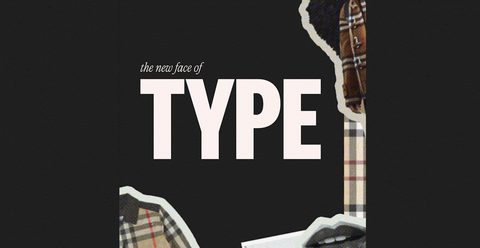
With the latest un-brand from Burberry, is modern type taking a backseat? Our team share their thoughts on the future of brand design.
Last week, Burberry unveiled their new (well, old) logo, reintroducing their “archive-inspired” serif look alongside their classic Equestrian Knight design. Boycotting their stripped back sans-serif type was met with an overwhelmingly positive response from consumers, Keen to see more distinctive designs rich in heritage and character, has the era of sterile and stripped back sans-serif type that consumed brands the 2010’s come to an end?
For our Midweight Designer, Tyler, the un-branding trend is sure to continue.
“Brands are wanting to go back to designs that stand out and have personality. The stripped back sans serif style had its place in the 2010’s, but it erased brand history and heritage. Consumers want to feel connected to brands, and a standout brand identity is key to that”
Going back to old branding styles is not only injecting personality back into brands, but also capitalising on the consumer’s sense of nostalgia. For Creative Director Anil, this comes as no surprise: “We’ve seen brands reverting back to their old styles in the past two years. If anything, Burberry are late to the party, but going backwards has been beneficial to them. It’s created more awareness for the brand, and consumers respect that they’ve shown that their rush to join the sans-serif trend was a mistake. Ultimately, nostalgia reigns supreme when it comes to branding.”
Emily, our Social Media Manager, also weighed in: “We must also look at the broader cultural context of this trend – in a post-covid world and living through a cost-of-living crisis – moving back to serif fonts with connotations of heritage and quality provides consumers with familiarity and nostalgia, brands that they want to invest in."
“The motifs we see within the fashion world ultimately become stylistic references for high-street fashion giants such as Zara before reaching the likes of Primark where trends reach the end of their cycle and fizzle. I don’t think it will be long before we start to see ‘heritage’ serif fonts and motifs blazoned across the clothing that we wear but it will be more interesting to see how this goes on to affect lifestyle and F&B brands.”
It’s not just the high fashion brands stepping back from modern trends to embrace nostalgia. In 2021, Burger King reintroduced their logo as a hybrid of their 1969 and 1994 designs, with bold red type sandwiched between two bun-halves. The brand claimed the reason for the updated logo was to pay tribute to the company’s heritage using a simple, confident, and fun design.
What does this mean for the future of design? Ultimately, consumers want brands that resonate. So, injecting strong personality through not only your tone of voice but also down to visual elements like your logo and typeface are important choices to make.
_____
At Together, we don’t just create or refresh brands; we use a blend of creative teams mixed with behavioural insights to produce content that connects with consumers on an emotional level and leaves a lasting impression.
If you’re looking to rebrand or want to spice up your campaigns in 2023, contact us today. We’d love to work on it, together.