NEWS ALERT - We won a SILVER IPM award for Best use of Social Media, 2025! Read more🏆
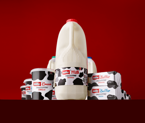
You know the classic Müller cow print you see across their products, advertisements, and the huge lorries you get stuck behind on the motorways? Yeah, that was us.
Müller is the nation’s favourite dairy brand. We worked with Müller to create a brand identity for their milk range by creating and trademarking a simple iconic design for the UK’s number 1 dairy brand.
We developed an entirely new brand identity for Müller. Starting with focus groups and workshops, we explored naming, propositions, and packaging that would connect with the overarching ‘Müllerlicious’ proposition.Trademarking the now iconic black and white cow print design meant that the brand had a point of difference in the market, a brand that was instantly recognisable to everyone in the UK.
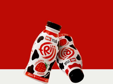
And when it came to redesigning their Frijj bottles, Müller came back to us for help.
We knew that Frijj already had a loyal consumer base, so the challenge was changing the design but not losing the core essence that was Müller. Using sensory-driven design and emotive language on the packaging, we combined the trademarked cow print and dialled up the flavour queues to find the perfect representation of flavour and freshness, all while being totally and recognisably Frijj.
The strategic design also gave room for any limited addition products that may come in the future.


