NEWS ALERT - We won a SILVER IPM award for Best use of Social Media, 2025! Read more🏆

“For me, a logo is about being recognised. Ultimately it's something people will see over and over again. You want that initial view to be memorable and then recognised when the audience comes to buy from or join your brand. It has a commercial role, it's not just about being visual. You want your logo to stand out and be different from your competitors. If you can make it stand out, be different and easily recognisable then you’re onto a winner.”
“There are a few different styles of logos, the first logotype is a stylised type, which is text-based. Google is a great example of a stylised type logo, it's bold and bright.

Pictograms are logos without any text and rely on the use of an icon, graphic or image. Apple is probably one of the most iconic pictograms. As soon as someone sees that apple they know it relates to the brand.

Finally, some brands choose to mix the two using text and imagery to create a stand-out logo.”
“There are many factors you need to consider when designing a logo. First of all, you need to know who your audience is so you can research what resonates with them. What other brands are similar to yours and are there any you aspire to be like? This can help you see what is already out there to ensure your brand isn't too similar but it also gives you an insight into what people resonate with in that industry. You must be clear on what the business is offering the audience and what context the logo is
going to be used in. Knowing where it will be seen and placed can help with design ideas and ensuring its sustainability.”
“This is a difficult question, it’s key to remember a brand is not just about its logo, it’s more about what the brand says or does. The logo can help encapsulate this but to show off a brand's identity and values you need to think about the bigger picture. It is common that when people set off on a branding project they think changing or creating a logo is the key, but it’s just one piece of the massive puzzle: branding.”
“Whilst designing any logos we will apply it to various media that we feel the business will need the logo to work on to ensure it fits well. For example, an energy provider will want a logo that will fit on a variety of objects and digital placements, from uniforms to vans and online. Whenever we design a logo we need to think about digital and physical applications. How well is it going to scale up or down? However, scaling the logo isn’t always the best option, sometimes we will design a smaller or bigger specific version of the logo to fit its desired placement. This version is usually a condensed version of the logo like a letter or an icon, but it must link to the master logo to keep that consistency and recognition.”
“For me, I start with old-fashioned pencil and paper. Once I have explored various ideas with pencil I’ll then move to the computer. Depending on the type of logo I’m designing will guide what software I need to use. If it’s a vector-based logo I’ll be using Illustrator, however, if the design is 3D or a moving logo I’ll need to use a 3D motion tool.”
“The first step is making sure you have a clear understanding of all those key elements we spoke about earlier. Then I’ll move on to researching and moodboarding. The moodboard will consist of more than just inspirational logos, it will contain anything I think relates to the brand or I can take inspiration from. This gives me a bit of fertile ground to work on and begin to be creative and start sketching up some initial ideas. From these ideas I can whittle it down to 2 or 3 designs that I think will work well for the brand. I’ll then apply the logo to different mockups and media to present to the client, this allows them to truly visualise the logo and how it would work in the real world. From this stage, it’s about working with the client to decide which option will work best for their brand and making any amends and final tweaks before we present the final logo.”
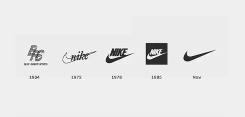
“One of the most iconic and recognised logos in my opinion is Nike and their swoosh. The reason the logo is so good is because it’s been plastered across billions of products in the last 30 to 40 years. The brand has constantly been in front of people meaning the logo is hard to forget. If you were to look into the history of the swoosh, the inspiration is quite abstract and many wouldn’t understand the rationale behind the design. The reason the logo has stood the test of time is because Nike have been playful with how they use the logo. There are no strict guidelines, the logo has been used in a variety of ways and sizes. From being on the side of a trainer to billboards and t-shirts the swoosh is used in various ways.”

Designing a logo is both an art and a science, the overall outcome of the logo is to be memorable, have stand out and represent your brand. It’s important to consider your audience, industry and how the logo will fit across platforms and media. With insights from James, we can see some of the considerations and process in how to design a logo that truly stands out.
Sources:
Google Logo: https://www.theverge.com/2015/...
Apple Logo: https://www.logohistories.com/...
Nike Swooshes: https://woven.agency/insights/...