NEWS ALERT - We won a SILVER IPM award for Best use of Social Media, 2025! Read more🏆

We immersed ourselves into the brand and immediately felt the love, expertise and passion at the core of what they do. But this wasn’t being conveyed into their visuals. Visually the brand felt neutral and anonymous, taking on a more functional approach to childcare rather than focusing on the fun and emotional side of things.
To make Busy Bees the first choice of childcare for parents, we had to reposition them. We wanted the branding to convey a nursery full of possibilities – to learn, grow and have fun.

Busy Bees' approach needed to be personal, with a philosophy built on the recognition that not one size fits all. Childcare needs to be fun, so we began using playful, irregular shapes that soon became the foundation of the brand’s visuals, from the graphic language and composition to campaign and film.
We changed everything but the name. Providing them with a new logo, bespoke typeface and colour palette.
We then got to work on their tone of voice, photography, film, and design templates.
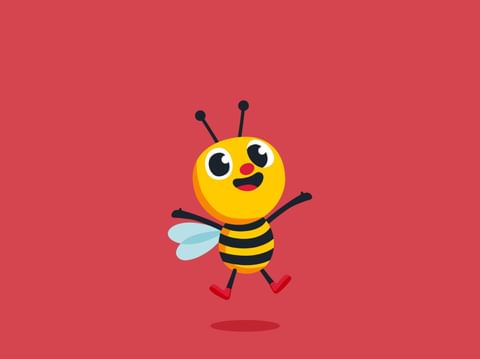
We also developed a fun, illustrated character affectionately named Bumble. Our non-binary bee became a representation of the brand, conveying a sense of confidence to both parents and children through it’s fun and warm vibe. Workshopping the creative process with mommas, poppas and kiddies confirmed Bumble was an effective character that brought the brand to life.
Jitin Topiwala, Chief Marketing Officer, Busy Bees