NEWS ALERT - We won a SILVER IPM award for Best use of Social Media, 2025! Read more🏆
When Tate & Lyle approached us to help kickstart the launch of their new sweetener, we knew we’d have our work cut out to help this tiny tablet make a splash in a sea of sweeteners. Especially when everyone knows that Tate & Lyle make sugar.
In recent years, Tate & Lyle has been expanding its focus beyond traditional sugar, towards a broader range of sweeteners and food ingredients to meet the needs of changing consumer preferences and regulations. This includes adding new sweeteners to their portfolio and partnering with other companies to develop innovative sweetening solutions.
One of the first to make it to market was the logically named Tate & Lyle ‘Sweetener’. But, could it become a sweetening staple? That’s where Together comes in...
Their problem is an extra sticky one... They’re not the only sweetener brand available and they’re almost exclusively known for making pure sugars.
We’re eternal optimists and felt that, in a sea of me-too sweeteners, there’s room for one to properly stand out. And their biggest challenge, of being known for quality sugar, could be turned into their biggest advantage when creating new products.
We realized that their logo is imbued with years of heritage, consistency and quality - it’s become a mark of excellence - immediately giving this new product a strength of perception that other brands would take years to achieve.
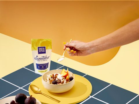
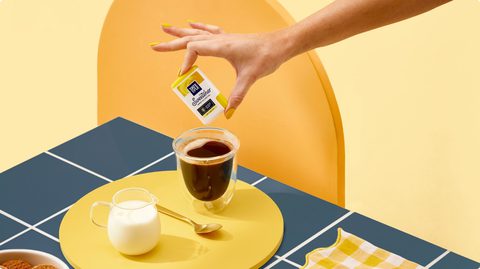
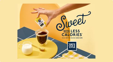
As with all our projects, understanding the specific audience and their behaviours enables us to create work that hits hard. And with this customer in mind, our approach aimed to create a brand presence that wouldn’t be out of place in a fashion mag laid on the table of the hottest café in town.
Our work had to complement the existing product’s design (we couldn’t change the packs). With that factor in play we explored how to give the campaign maximum impact. The answer was a bold splash of colour, a custom set design, a few licks of nail varnish and styling that gave cause for a second look.
Bold copy lines with personality accompanied the fresh, contemporary styling to give the little packs a mighty presence.
The resulting campaign ran across OOH and digital placements, targeted specifically to the audience we had defined. As the campaign gained momentum, we created a POS toolkit to further set them apart instore.


